Pool View Story
November 25, 2022
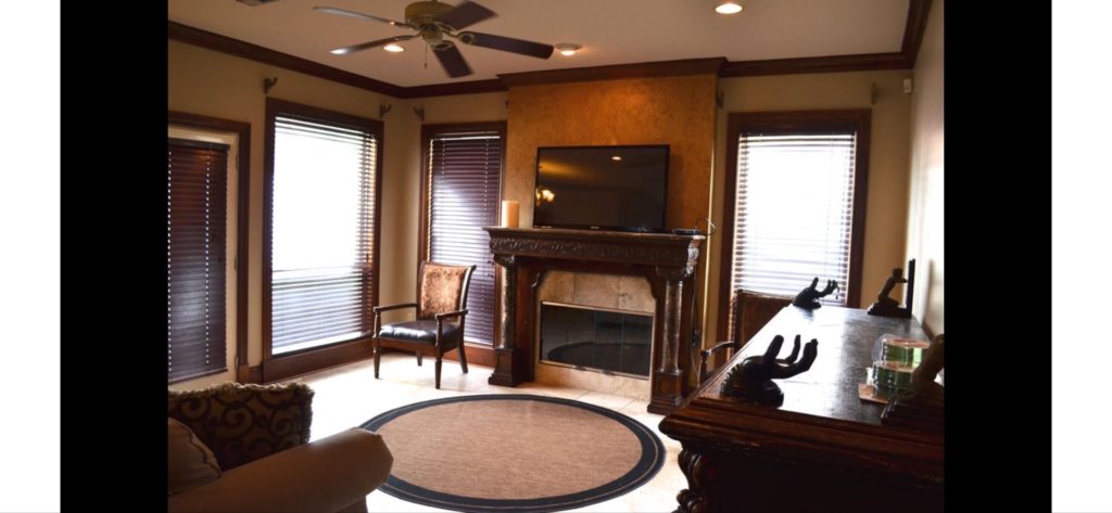
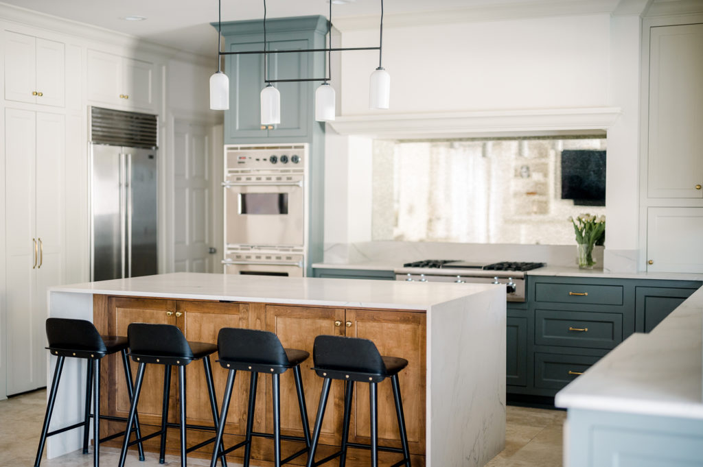
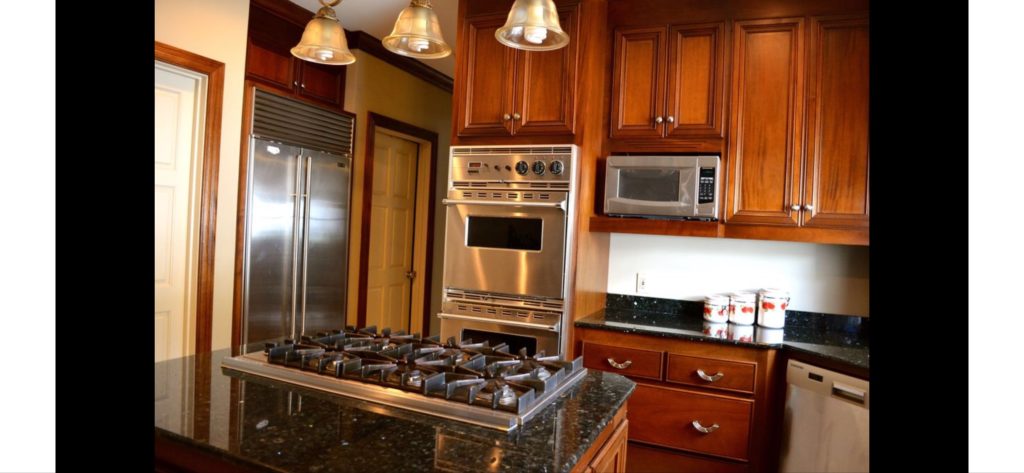
In the story of Pool View, we started by looking at the incredible design potential that stewed beneath dark drapery and narrow spaces. The home is gorgeous with double height ceilings, ornate metal details, and large travertine tile throughout. After living in the home for three years, the homeowner’s decided it was time to create a kitchen and living space that fit their lifestyle.
Big Picture- Existing Conditions vs. Design Proposal
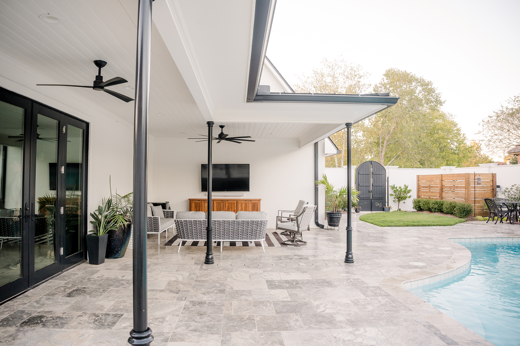
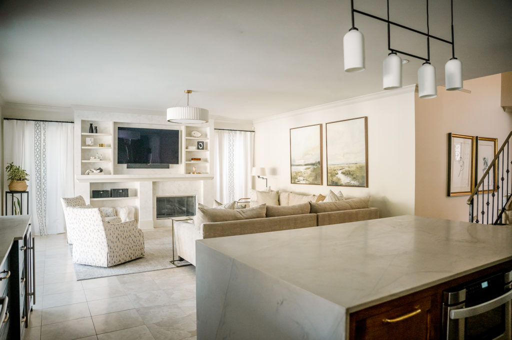
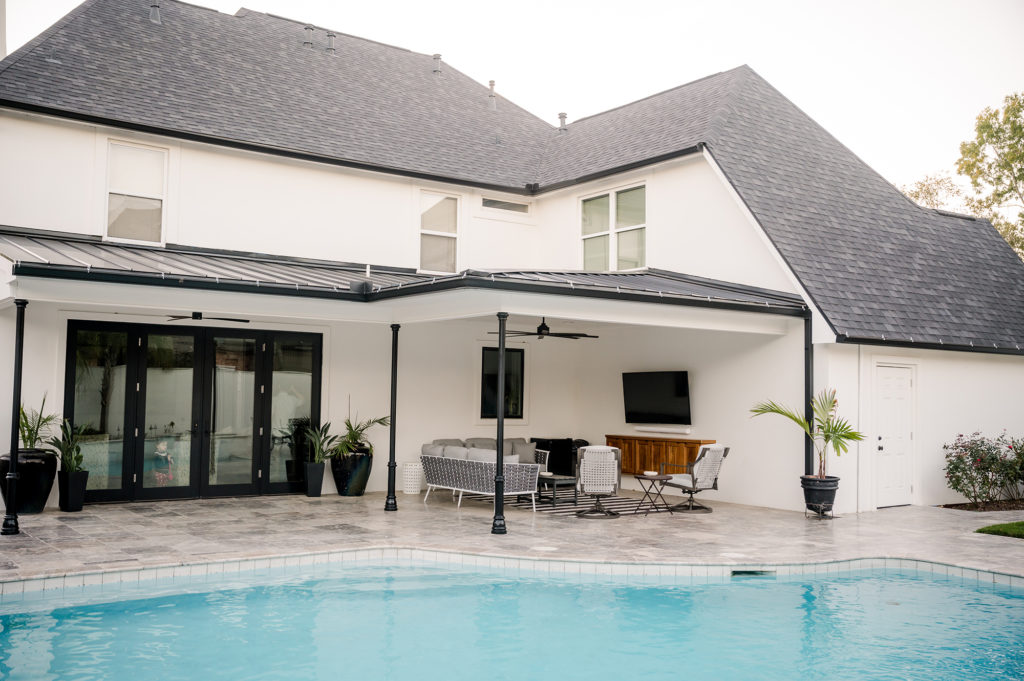
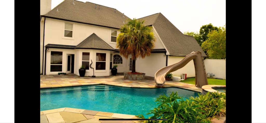
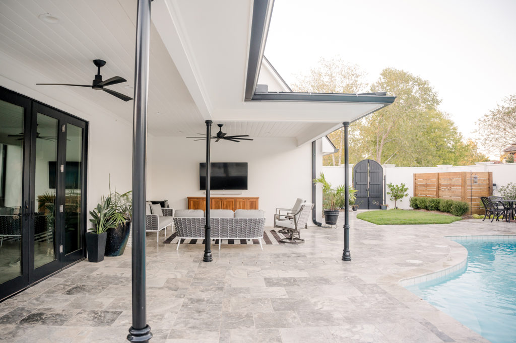
The first site visit mapped out key dimensions and functions that needed to be addressed. First, in the kitchen we had aisle widths that were too narrow followed by a peninsula counter top. Check out the blog post Must-Haves for Your Kitchen Design addressing functional and circulation issues with this type of layout. Second, we needed to address the under-utilized area surrounding the existing pool. In South Louisiana, we cannot have outdoor gathering spaces without coverings. Between rain and sun, you will hardly find a good time to use the space. Knowing this, we had another big item to address. Third, giving the size of the home (>3000 sf) our living space needed to contain more square footage for larger furniture, more window light, and entertaining space. The biggest opportunity in the design of the living space was bringing the pool into focus from the living room. Prior to the design, there was hardly a connection to the beautiful outdoor existing space which also needed a little facelift. In the existing home’s defense, the backdrop of white stucco and flagstone was not a bad place to start. However, we knew that landscaping was key to creating more of an “oasis” for this backdrop of the living space and outdoor covered space. A special thanks to our landscape architect for mimicking the curvature of the pool into the grassy area, as well as some incredible plant selections. The last move addressed was access to the covered area from the living space. Most of our exterior influences in this climate deal with access during rain. The idea of not connecting the covering and the kitchen or living space was not an option. We added a small shed style roof across the new large set of doors to provide easy access to the barbecue pit and outdoor living space.
Details- How can the proposal still fit?
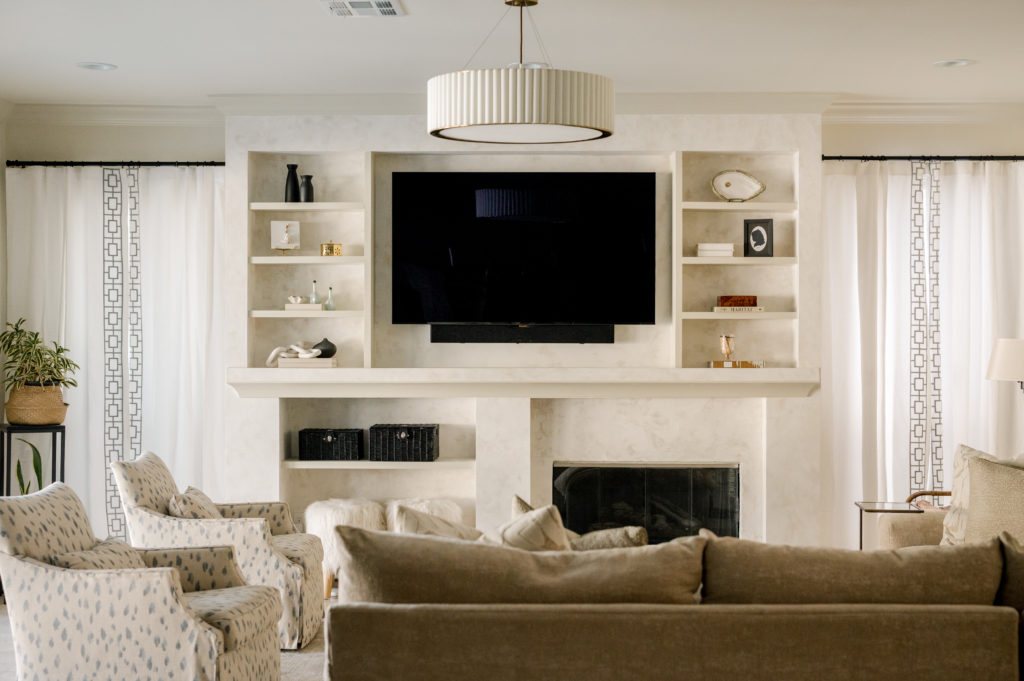
From the large details to the granular, we need to look at the fireplace and proposed roof lines. In the design, we added four feet to the existing kitchen and living, while also flattening out the back wall. By removing the bay window, we gave this space back to a bar area (kudos to our interior designer Collet Co. Design and our homeowner for this wonderful idea). However, in this new layout we had an offset fireplace creating a bit of design challenge. After multiple iterations, nine to be exact, we settled on a version that balanced the television, firebox, shelving, and extra seating. A design we are most proud of to this day. When moving outside, we see a very simple and low-profile roofline for the addition. This minor detail, influenced by the complexity of the existing roof, allowed for no alterations of the existing main roof. Also, the low profile shed roof allows for the focus to be on the space beneath while providing no impact the bedrooms windows above.
Team Effort
This project was special in so many ways. This was our first opportunity to work with an amazing team from interior design, landscape architect, and a wonderful construction crew. Special thanks to Double C Home Repair. All of this would not be possible without our amazing homeowner’s who patiently waited through weather delays and unknown existing conditions. Behind this great project was an amazing client filled with trust, creativity, and patience. Cheers to many years of entertaining and family moments being shared in your wonderful new home.
Click here to view all the images from this beautiful residence!
NEW ORLEANS, LA architect - SPECIALIZING IN RENOVATIONS
BRAD MICHAEL architecture
architect for the conscious and inspired
follow along @bradmichaelarchitecture